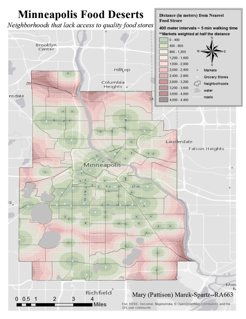
This map is part of a series of maps that expanded on a previous analysis from RA 654, Introduction to Urban and Regional Planning. It is a visualization of Minneapolis food deserts. I used Euclidean distance to calculate a raster across the extent of Minneapolis that shows the distance, in 400 meter intervals (~5 minutes of walking time), from each grocery store point. This is similar to the original map made for RA 654, except the food stores were weighted differently depending on their type. Each point was classified as either a grocery store, which included chain stores and Co-ops, or as a market, which included small corner shops and delis. A Euclidean distance raster was created for both point types, but the markets were weighted at half the distance using the Raster Calculator. This assumes that patrons are willing to walk twice as far to get to a large grocery store with potentially more products.
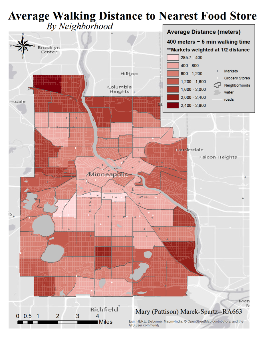
This map uses the Euclidean distance raster and zonal statistics to calculate a map showing the mean distance a person would have to walk in each neighborhood to get groceries. In this type of map, it is also important to note that the average walking distance also depends on the shape of the neighborhood.
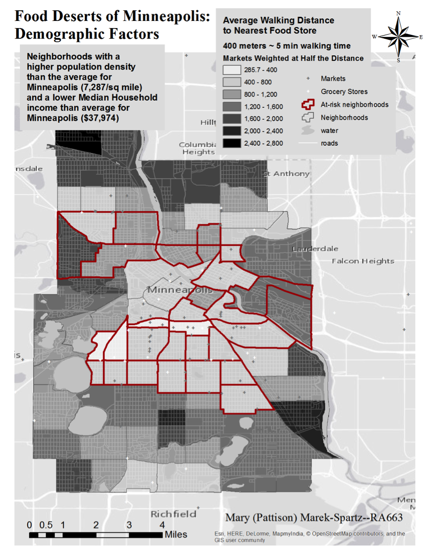
Food deserts are also defined by the socioeconomic status of the residents in that area. Highly populated, low-income neighborhoods are more likely to be underserved by food stores and instead served by fast food chains that move in to fill the void. This poses many health risks to the community. To identify these at-risk neighborhoods, I selected neighborhoods that were greater population densities than Minneapolis as a whole, and that had below average median household incomes for Minneapolis. Theses neighborhoods (highlighted in red) were overlaid over the Average Walking Distance to Nearest Food store map.
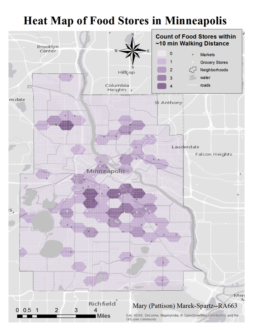
Not only is the distance to groceries important, but the variety as well. This heat map shows the density of grocery store and market points. Some areas are served by only one or two stores, where other areas, such as along Lake Street in South Minneapolis, are served by a large variety of food stores. However, this map is not good for assessing food stores that are located on the edge of a polygon, as they may be serving areas just over the border. This is why the Euclidean distance maps are better for identifying food deserts.
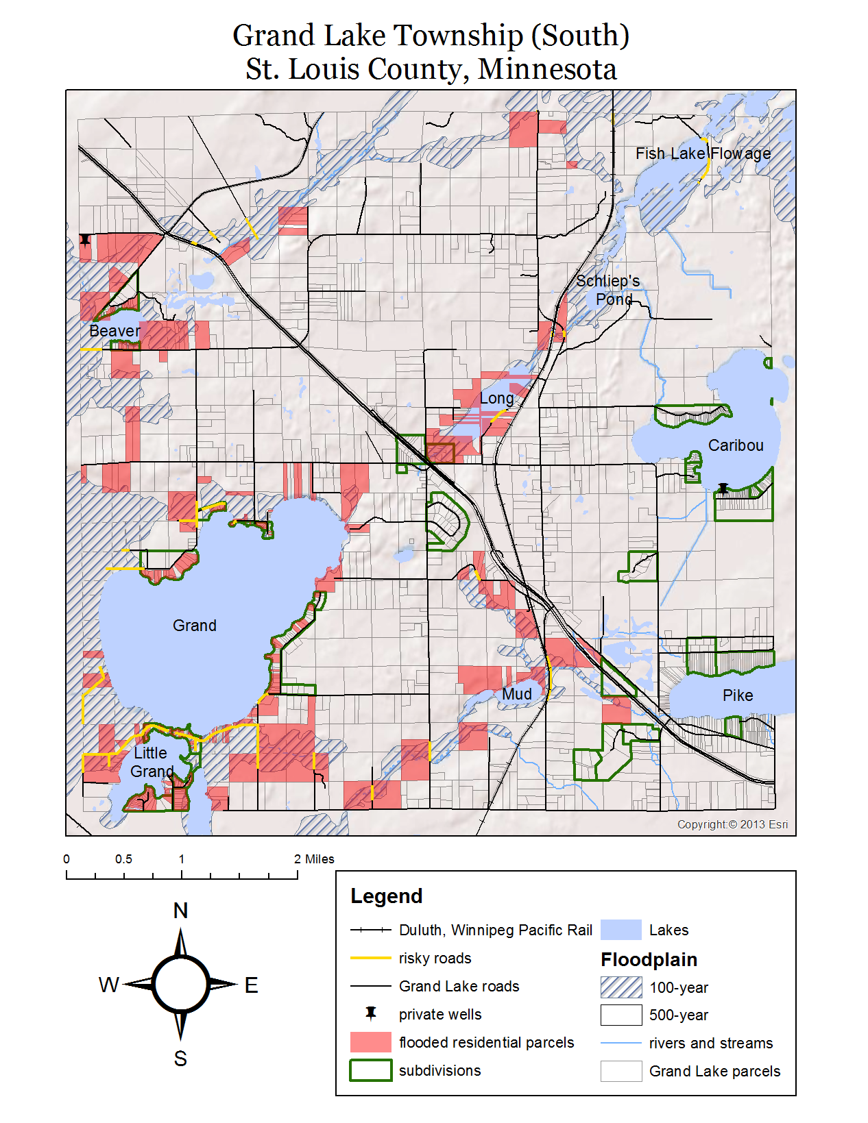
A map of parcels, road sections and subdivisions that are at risk in the event of a 100-year flood in Grand Lake Township, MN created for Spatial Analysis of Geohazards using GIS (RA 651).
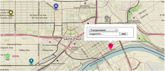
The image above links to a web application created for Internet Mapping (GIS 608). This is a html and javascript application that was written using Leaflet, Mapbox, and Firebase. The Suggestion Box is designed to obtain a user’s location within Saint Paul and allow them to write suggestions under several categories for city improvement.
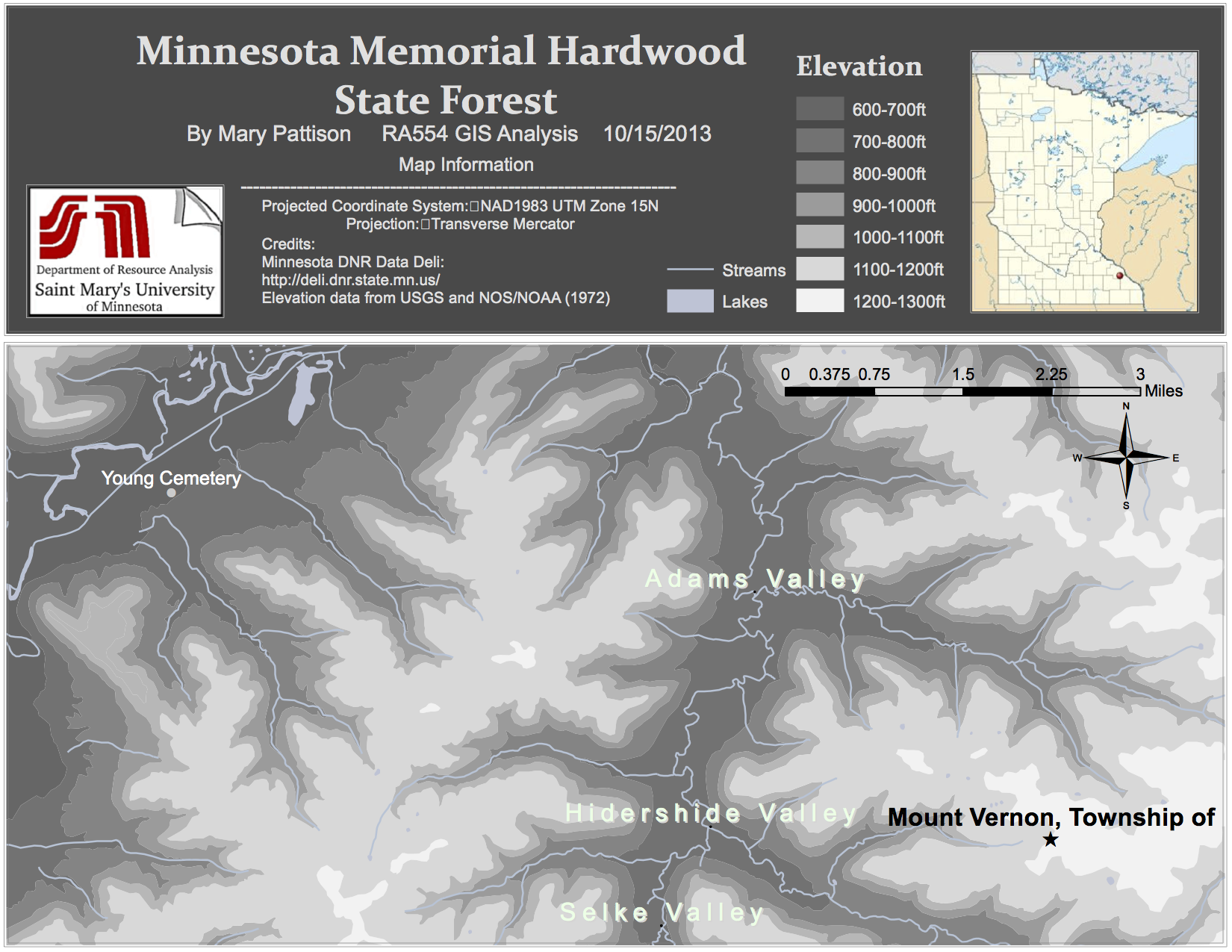
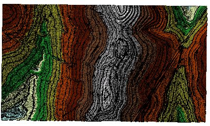
This is a topographic map of the Minnesota Memorial Hardwood Forest that was traced from a USGS map and scanned and digitized in ArcGIS. The scanned contours were symbolized to show elevation.
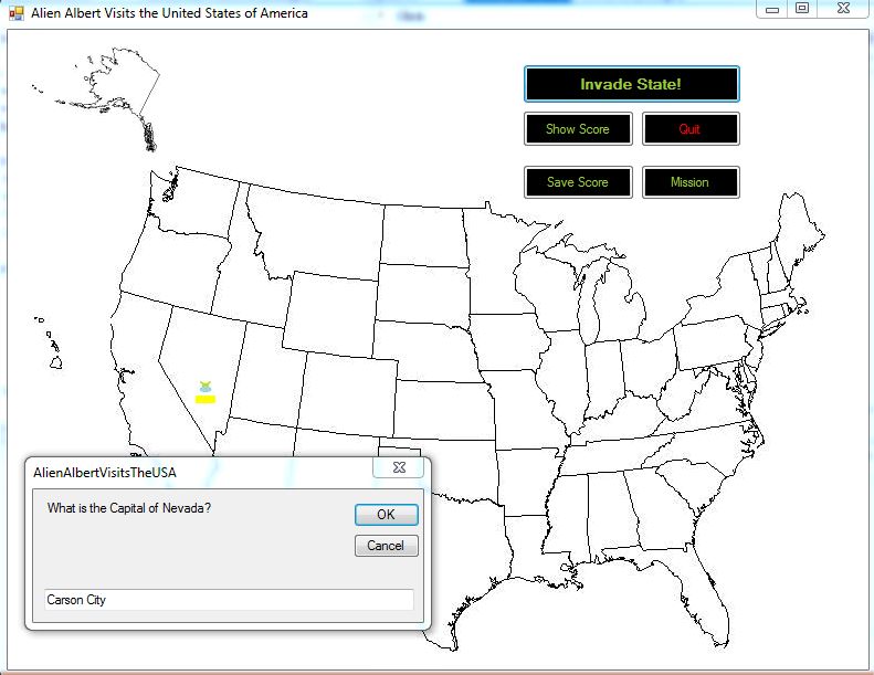
The image above links to a program entitled ‘Alien Albert Visits the United States of America’. This is an educational geography computer game designed to teach U.S. states and capitals. It was built using Visual Basic in Visual Studio Express for Desktop 2012 for Programming languages (RA 632). It was inspired by Swamp Gas Visits the USA, a game released in 1990 for Macintosh. This program incorporates animation, randomization, loops, If statements, Try statements, Arrays, structures and more.
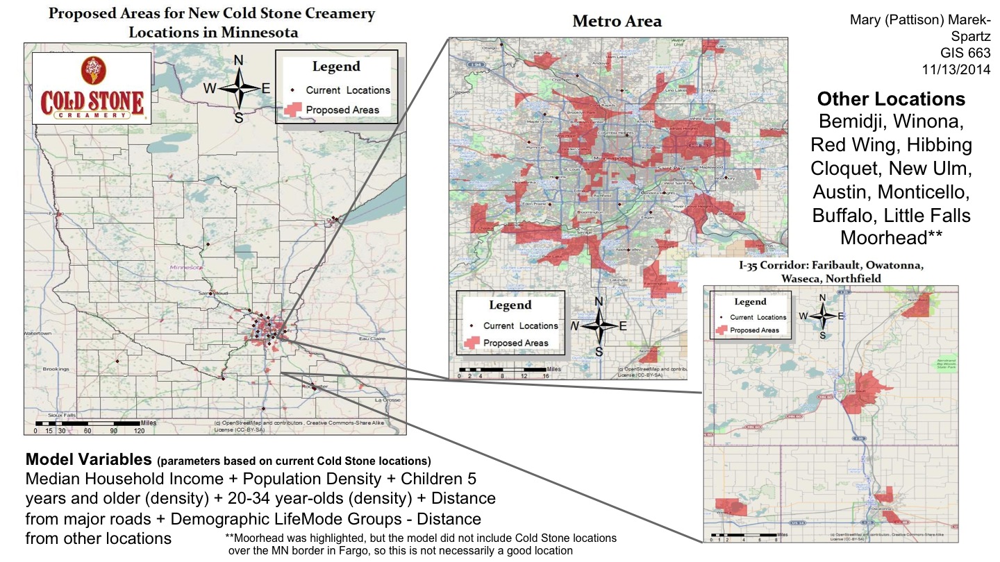
This map was created for Advanced Modeling and Analysis (RA 663) to identify suitable locations for a new Cold Stone Creamery location in Minnesota. The model uses variables such as household income, age, population density, and distance from major roads to output a map of possible locations throughout the state. Buffers were used to make sure new locations were not too close to existing creamery locations.
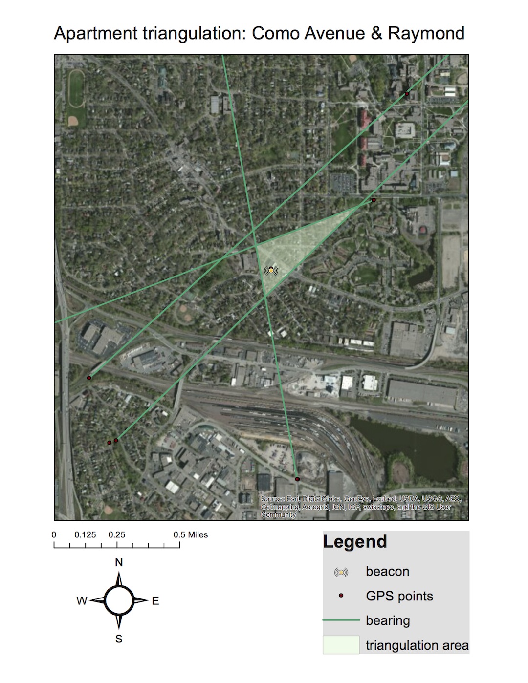
This was part of a radio telemetry project for Spatial Data Methodology (RA 556). We conducted a ‘fox hunt’ in which one member of the team takes a programmable transmitter to an unknown location. Using a directional antenna and a compass, we drove around and marked locations with a GPS and took bearings with the compass in the direction that the beacon signal was coming from. We then mapped the compass directions and GPS waypoints in ArcGIS and estimated the location of the transmitter to be the area where the direction lines intersect. We also mapped the actual beacon location (yellow dot) to see how accurate our estimation was.
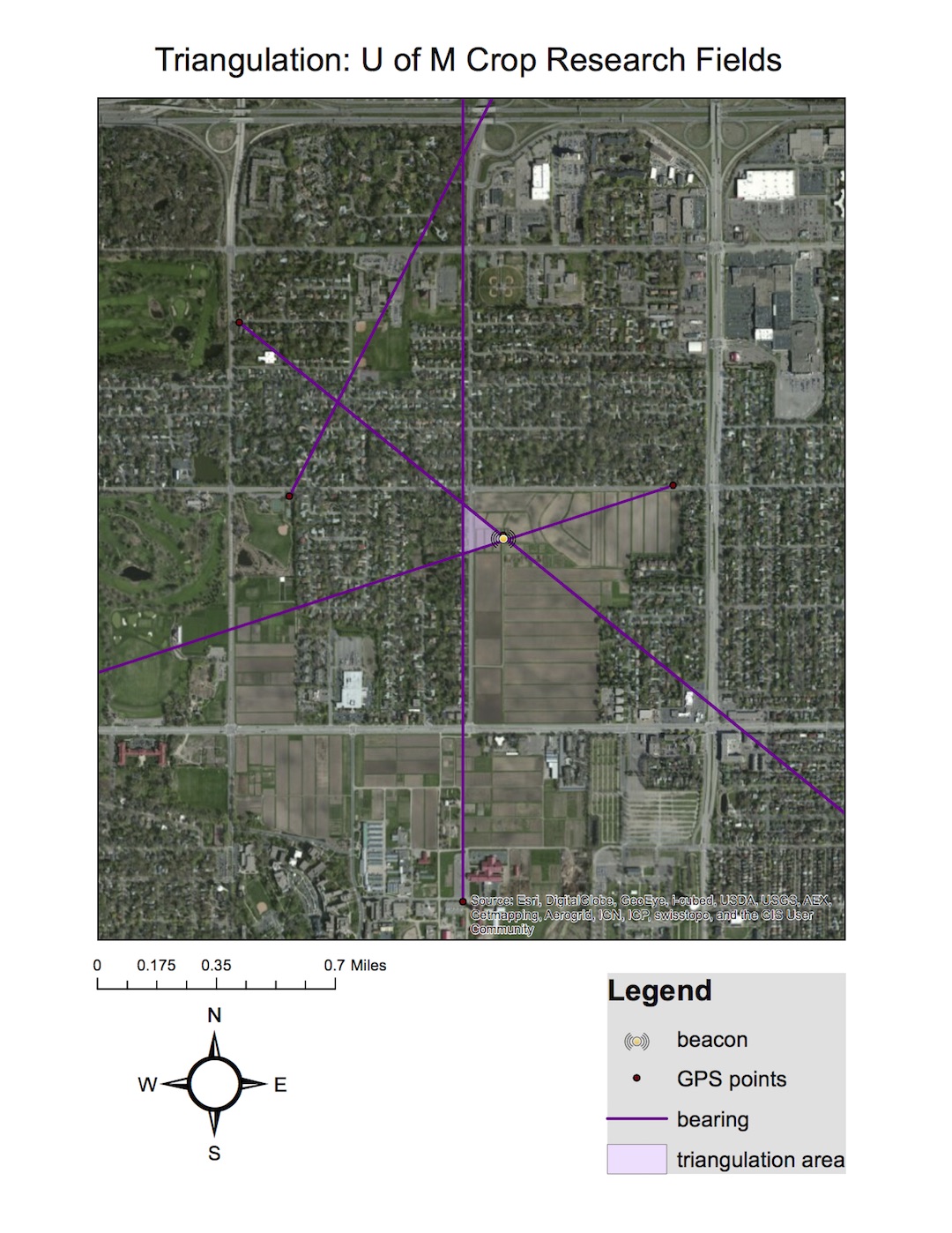
A map of one location triangulated in the fox hunt at the U of M crop research fields.
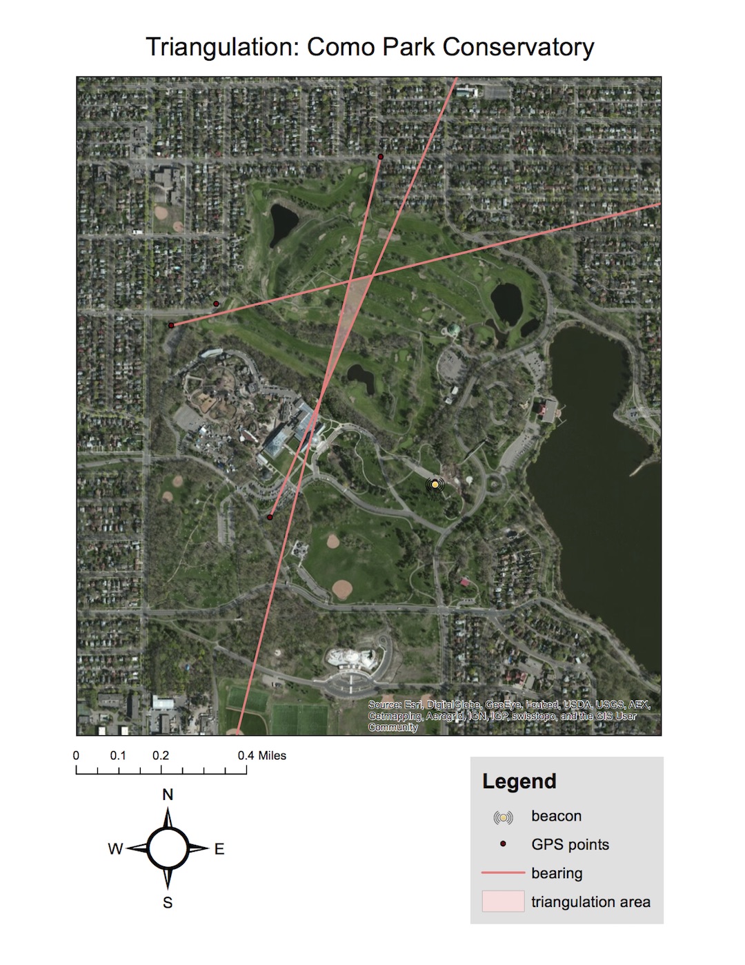
This is another location we triangulated as part of the telemetry project. This estimation was off from the actual location, likely because it took place at Como Park and the giant dome-shaped Como Conservatory building was in the way of our signal for each bearing we took. The shape of the building may have been deflecting the transmitter’s signal, so we learned that we needed to account for building when using this methodology.
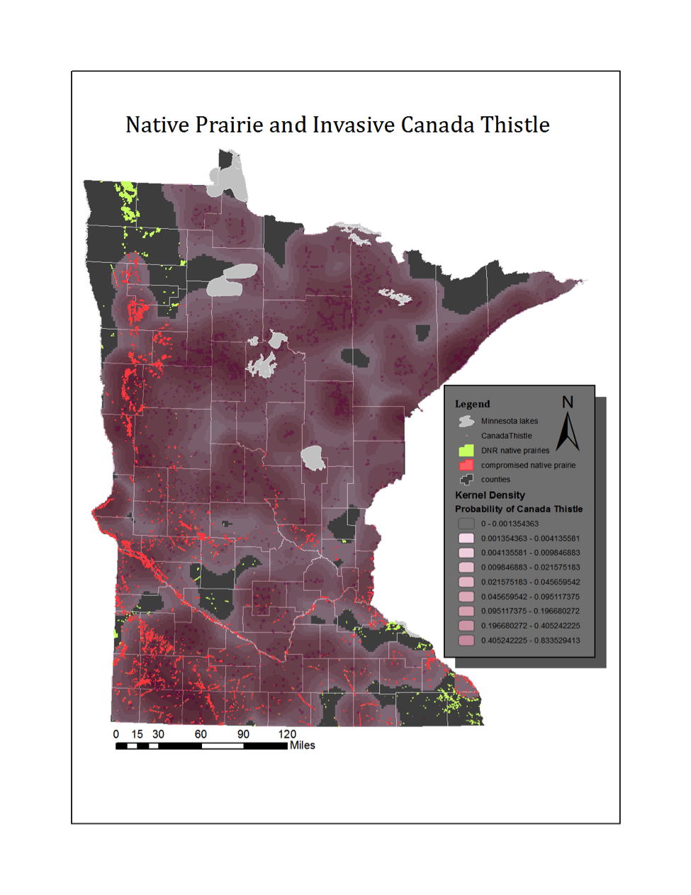
This map uses a kernel density analysis on DNR invasive species data to visualize the distribution of Canada Thistle and its encroachment on DNR native prairie sites. This analysis was run for two other invasive thistles based off of the Canada Thistle kernel.
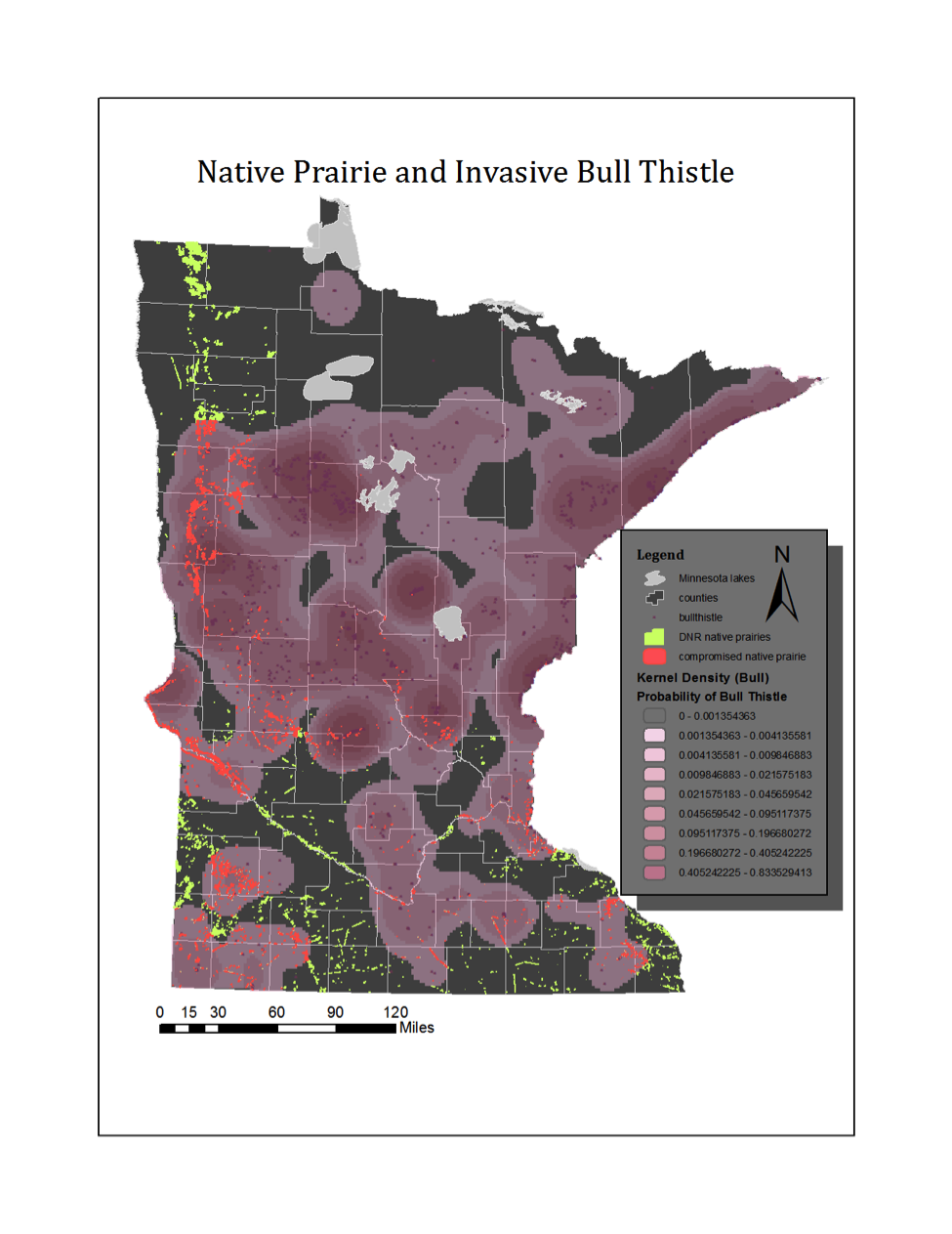
Kernel density analysis of Bull Thistle
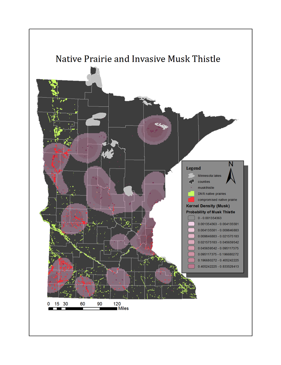
Kernel density analysis of Musk Thistle
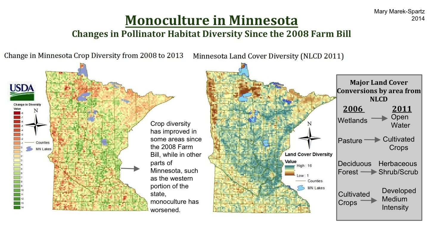
These maps examine change in pollinator habitat by looking at crop and land cover diversity in Minnesota. The left map shows the change in crop diversity since the 2008 Farm Bill using data from the USDA. Zonal statistics were used to measure the diversity of crops in each zone and the 2008 diversity raster was subtracted from the 2013 diversity raster. The right map shows land cover diversity in 2011. Additionally, an analysis on landcover change was conducted on the NLCD data to show most frequent land cover conversions from 2006 to 2011.
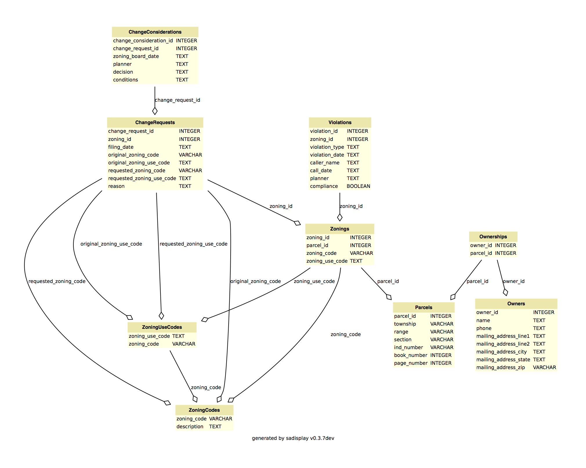
This database (created for RA 642) was designed to maintain information about parcels, parcel owners, zonings, zoning violations, and zoning change requests. The database was created using the relational database management system, SQLite.
A TIN created while working with LIDAR data for Advanced GIS (RA 570). In ArcGIS, LIDAR data was converted into a multipoint feature using all classification types. The multipoints sort thousands of points into one database row and reduce time and storage costs. The multipoint tool was used to convert only classification code #2 (Ground) to get bare earth points. The bare earth multipoint feature was converted to a raster and then the “Create Tin” tool was used to make a TIN of the bare earth raster.